Things move quickly now. Once I settle on a design for a book, the missing pieces fall into place. Chapters are designed. Editing begins. My nether regions dilate to 10cm. The push begins.
Oh, and passive voice is eliminated.
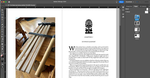
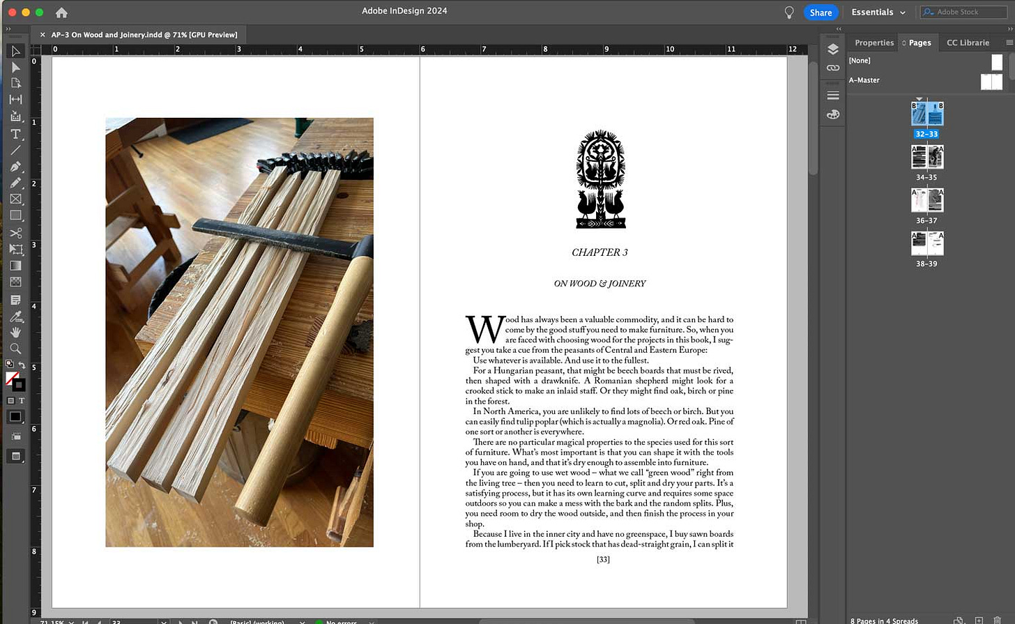
About the book’s design: For the last 12 years, my ideas about page design have turned away from the whitespace-heavy, overly flexible post-grid methods I learned in college. My guiding star is “Methods of Book Design” (Sceptre, London) by Hugh Williamson, a 1956 text that few designers use today.
The book was published at a turning point in print production. Offset printing was replacing lead type, and soon the worlds of design and type would explode, both in variety and flexibility.
“Methods of Book Design” is a glimpse of a world with far more limitations than we have today, back when a press might have just a handful of fonts available to use. Photos and illustrations were expensive to reproduce. The typography had to carry a heavy load in organizing and relating…
Keep reading with a 7-day free trial
Subscribe to The American Peasant to keep reading this post and get 7 days of free access to the full post archives.


