

Lessons from a Paste-up Bunny

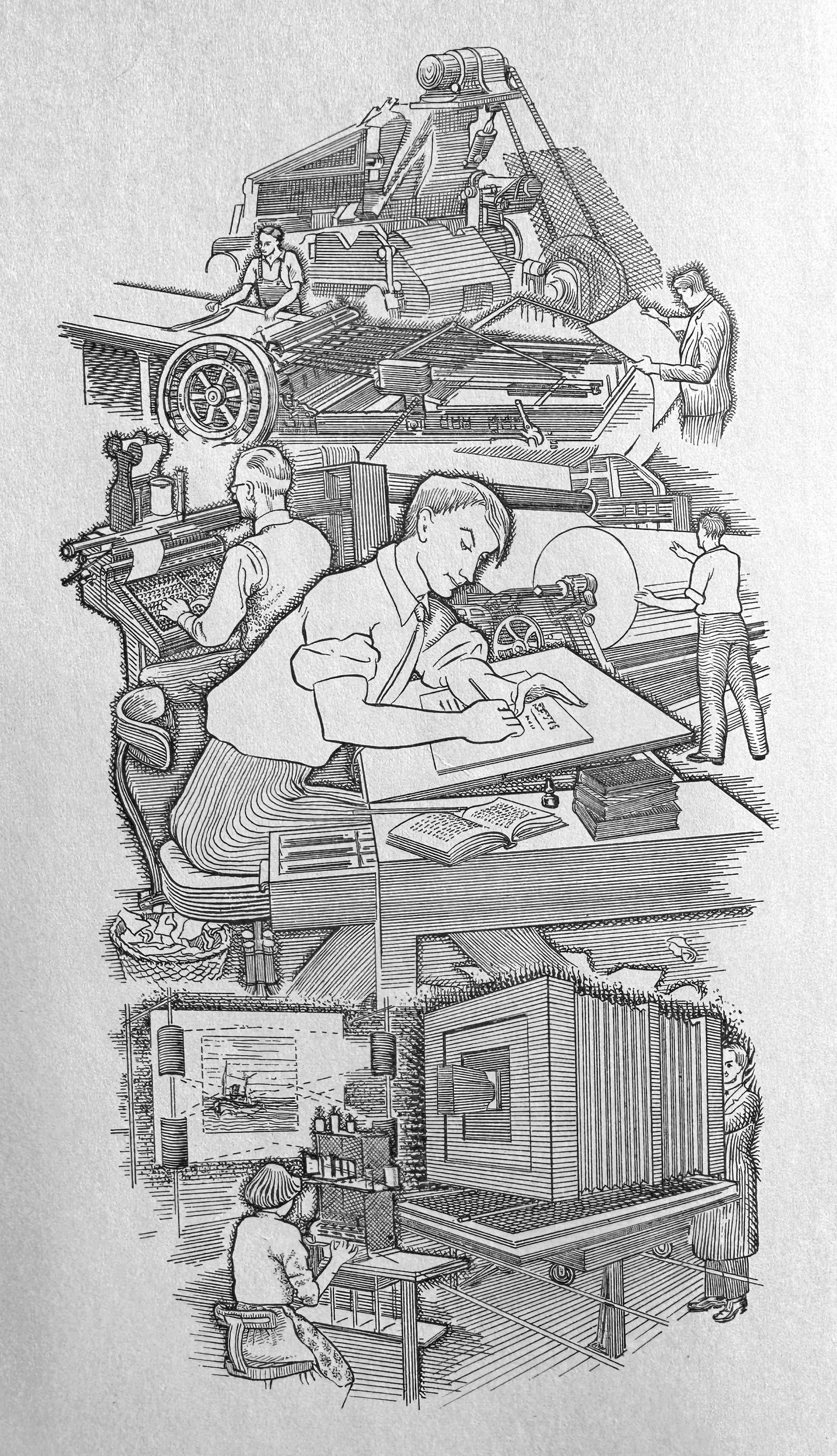
All through college I had a night job as a production assistant at a publishing company to help make ends meet while living in Chicago.
Four nights a week, I took other people’s graphic designs and built them into “paste ups” – a full-size representation of a page that eventually became the plate that was fastened to the printing press.
It was not a creative job. It was entry-level. And they typically hired only women for the task, so they called us the “paste-up bunnies.”
During my four years there – 1986 to 1990 – the production shop changed completely. We started as a “cold type” company – where we produced type with film and chemicals – to desktop publishing, the click-and-drag world we live in today.
For my first three years there, we lived and died by “the grid.” Every page was divided up into a grid of non-repro blue lines that were 1 pica apart (yes, I know another measurement system besides metric and American customary units, and I can still think in “picas” and “points”).
Everything – and I do mean everything – had to relate to the grid in some way. Even avant-garde shit had to use an underlying and logical structure so the paste-up bunnies could create the designer’s vision.
In 1990, we switched to desktop publishing. It was like someone had removed all the maps from under the seats of all the cars, released all the people in prison and granted a graphic arts degree to everyone who owned a mouse.
Graphic design isn’t worse now, but it’s less rational and consistent. Designers now do things that were literally impossible in the 1970s. I salute them, but I also stick to the old rules when laying out our books.
Even though you can ignore the old rules these days, there are great advantages in knowing them and (if possible) following them.1
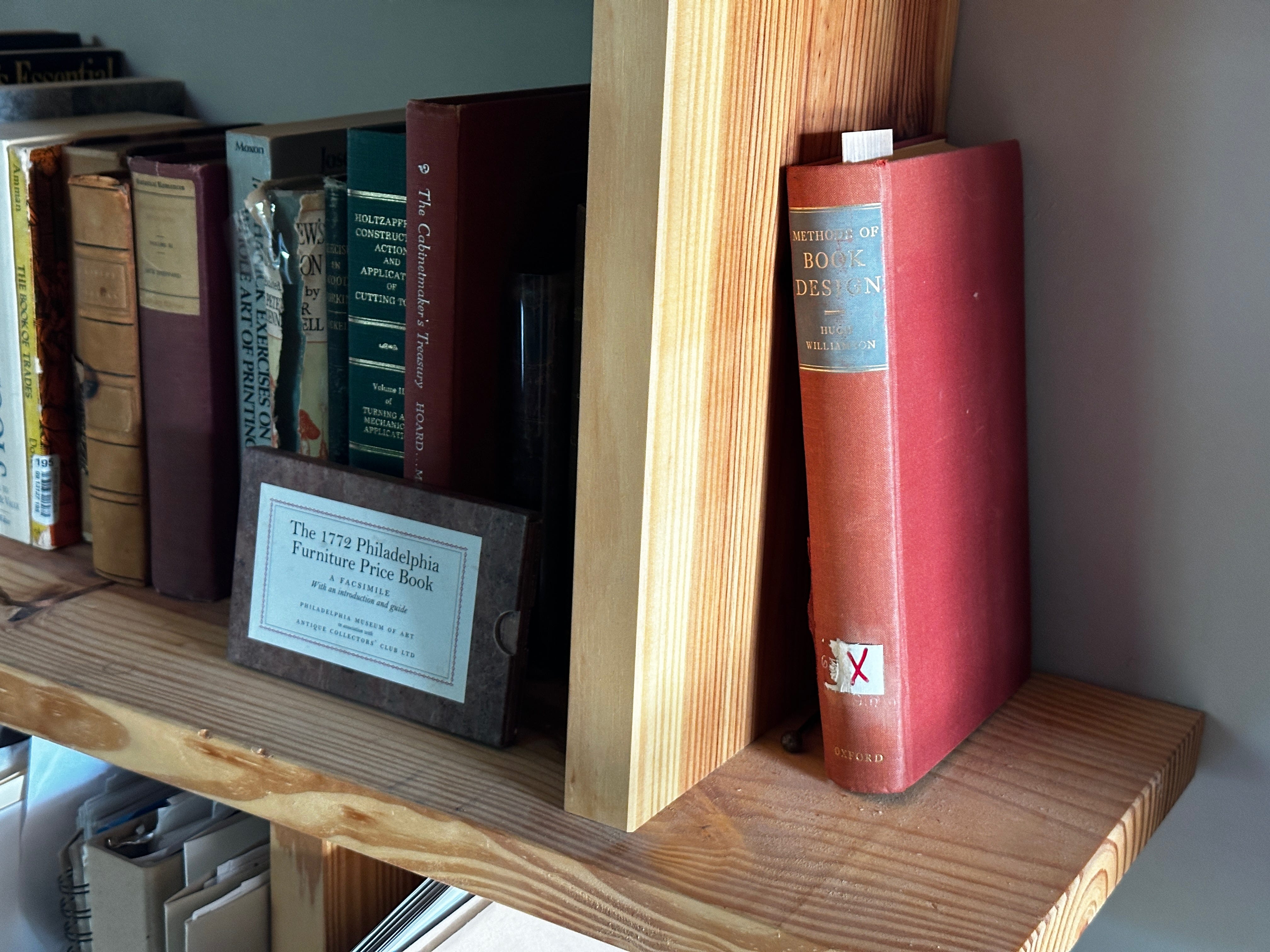
My guide is “Methods of Book Design” by Hugh Williamson. And though I am not a church-going fellow, I completely understand Christians’ attraction to the Bible. I consult Williamson almost every day when designing a book. When I face a question about typography or page structure that I can’t answer, Williamson is both a guide and a comfort.
The Furniture Connection
If I haven’t lost you yet, here’s the payoff: Yes, there is a “Methods of Book Design” for furniture. The book is in the public domain and is also available as a self-destructing “print on demand” version. But the original book – an absolutely gorgeous tome from the Arts & Crafts era – is difficult to find.
One of my projects this spring has been to bring this book back into print with its original high-quality manufacturing details. Excellent coated paper, properly sewn and glued signatures, and casebound.
It’s probably folly because you can get the book for free on the internet or order a cheap photocopied version. But I decided to take a small gamble that there are 3,000 woodworkers out there who will appreciate the information in a permanent binding.
The book is titled “Industrial Arts Design” by William H. Varnum. It was published in 1916 to help train industrial arts instructors to teach design. The book deals with furniture, ceramics and metalwork. All three crafts are regulated by the same rules laid out by Varnum in absolutely crystal-clear detail.
If you’ve been building or studying furniture for a while, there are some of these rules you know by instinct but not by conscious thought. By laying out his simple principles, Varnum makes the basic design process rational and not regulated by the dark arts of inspiration or creativity.
In many ways, Varnum’s rules prepare you for creative leaps. Here, he says, are the rules established by hundreds of years of furniture making. You can work within this comfortable envelope, or you can deliberately step outside his guidelines.
His approach is compatible with George Walker and Jim Tolpin’s writings on design. In fact, many of their ideas from “By Hand & Eye” (such as whole-number ratios) integrate easily with Varnum.
I invite you to decide for yourself for free by looking at the Internet Archive’s scan of the book here. Read the first few chapters. If you don’t feel scales falling from your eyes, this book isn’t for you.
The crappy print-on-demand version has been retitled “Arts & Crafts Design,” which is an odd title because it implies the principles apply only to Arts & Crafts designs (and they don’t). You can Google it if you want to buy it print on demand. I’m not a fan.
Our version of the book should be in house next Thursday (June 27). The printer and I worked for weeks to match the paper and printing process (stochastic printing) to accurately reproduce the text and illustrations.
We renamed the book “Principles of Design.” Our book uses the title’s original 7" x 9-5/8" size, is printed on a heavy #80 matte paper and includes a new preface. It is hardbound, 254 pages, made in the U.S. and will cost $41.
Because this title is a reprint of something people can get for free, we decided to do only one printing of 3,000 copies. We simply don’t have the space in our warehouse to stock this book indefinitely. Plus, I’m not even sure there are 3,000 woodworkers who want this title. We’ll see.
I also don’t know if we will be able to sell it through our retail outlets. Most of them don’t like to carry limited-edition books.
Despite all this, I’m excited about this book because I will own a nice permanent copy of a book that has earned a place next to Williamson’s “Methods of Book Design.”
And maybe a few other woodworkers will feel the same way.
Classic typography aims to use the smallest amount of space to make the most words easily readable for the least amount of money. All three elements are important, and they are grounded in decades of studies that sought to make text as easily digestible as possible.
I’m in, too. The internet version is promising, but pages that estimate at more than 30% accurate are few, and actually seeing the plates would be awesome.
I will buy one for sure!